Above this paragraph should be the H1 heading for your web page. Do not use H1 within your blog post area. The first paragraph is there to tell your readers what the recipe is about, and entice them to read further. Make it punchy!
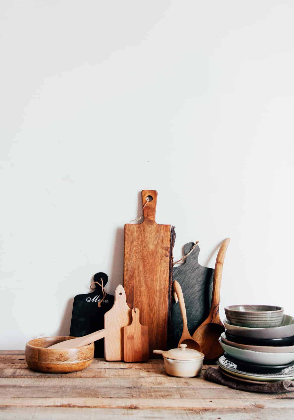
Inside of this test data section, you'll find most of the basic HTML and XHTML and CSS styles that you might use within your WordPress Theme.
This is the H2 Heading
Headings are meant to make your content easily scanable by your readers. We recommend breaking down content by sections that people typically scan by such as:
- ingredients
- instructions
- nutrition and calories
- substitutions
- gluten free
- dairy free
- low carb
H2 headings should be used to separate chunks of your post text. It also helps search engines to scan your content easily and serve up keyword-rich content to people searching for you. Always start with H2 and then if you need to divide up a chunk of content further, use your H3.
Cooking Tips
- This is a sample cooking tips list
- tip #2
- tip #3
- and then we wrap it up
This is the H3 Heading
We recommend avoiding h3 headings whenever possible
Do not use h4 headings
H4 headings are generally too nuanced for recipes and unnecessary.
- General Lists using the
<ul>tag - Ordered Lists using the
<ol>tag - And that's the end of the lists
And we’ve just tested a paragraph before and after a general list along with a nested list to help you see what at least three levels of the list will look like. Make sure that each level of the list is styled to match your specific needs.
You might want to use the default disc or circle, or you might want to add graphic bullets to your list, too.
Do not use h5 headings
H5 headings are generally too nuanced for recipes and unnecessary.
We also need to look at the other two lists and then add some images and other styles to flesh out your WordPress site.
- You need to do this first.
- You need to do this second.
- You could do this in between.
- Or give this a try, too.
- But this is the third and last thing to do.
And here is another paragraph to show the relationship between the various parts and pieces.
Do not use h6 headings
H6 headings are generally too nuanced for recipes and unnecessary.
See the modern guidelines for page headings for how to properly structure recipe posts.
This is another H2 Heading
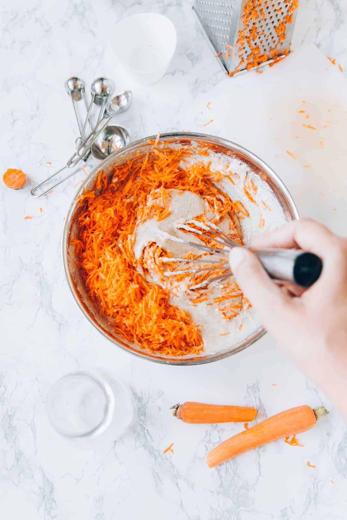
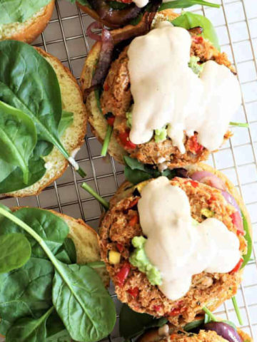
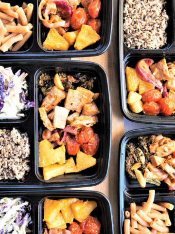
Let's take a look at how images work in the theme. Typically, most food bloggers are going to use full-width centered images within the body of a post, but we'll explore the right and left alignment options here just in case. This photo is using the medium image size and is aligned to the right. In order to clear the space below this image, I'm going to use the "clear" div class in the text editor for this post. Otherwise, things would look very misaligned.
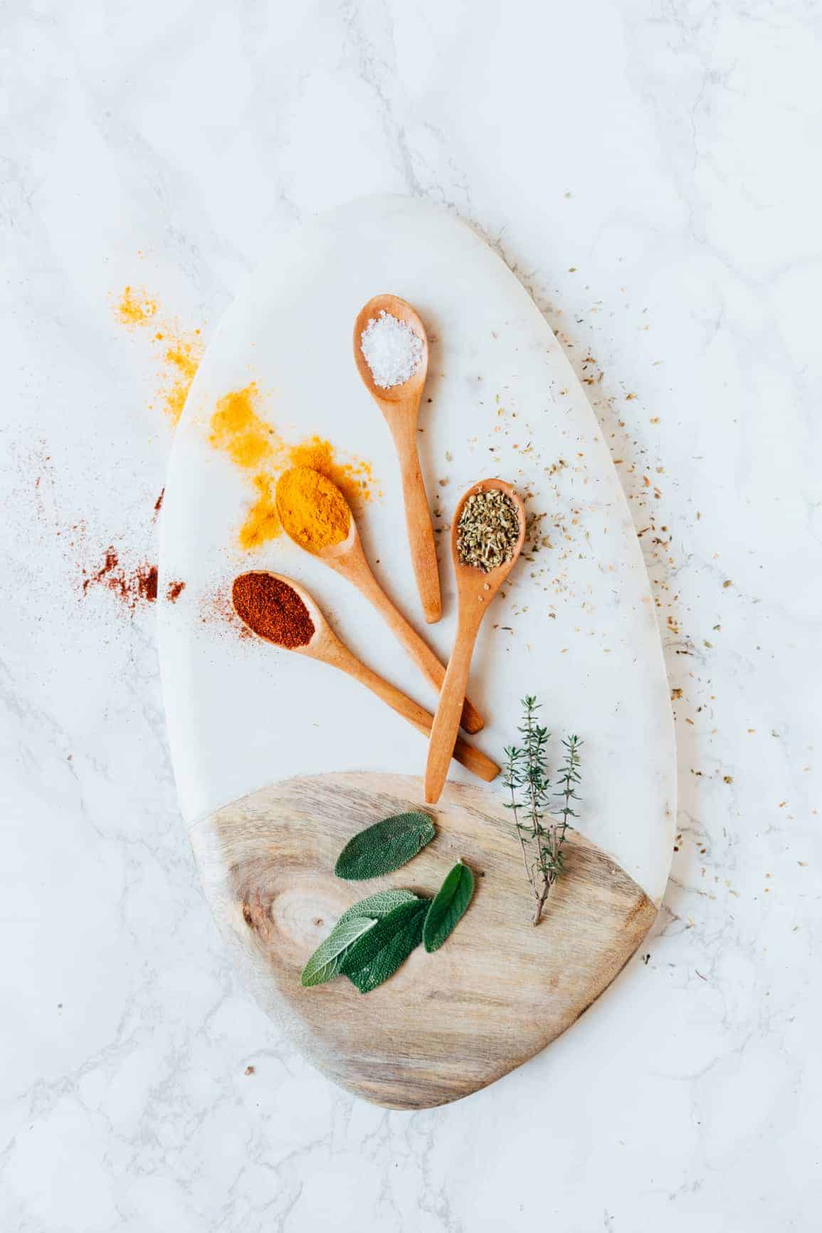
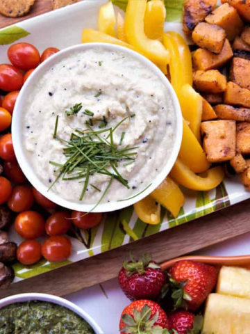
A centered image is a little different. It is centered in the middle and the text is pushed above and below it. This is the way we prefer food bloggers to use images: full-width and centered.
How to add the CSS styles for images is discussed in the Codex article, Using Images.
Testing Font Looks
You will need to test the looks of the different font styles, too. This is bold and THIS IS BOLD. This is italic and THIS IS ITALIC. This is bold and italic and THIS IS BOLD AND ITALIC. This is code and THIS IS CODE. And now let’s look at what the PRE tag, also known as the preformatted tag, looks like:
This is the pre tag.
It should be formatted as written
     so if you add spaces to the front of the line
  it will show the spaces and the <code> as written
This should be back to the normal paragraph style and we hope you have been paying attention to the margins and padding around each element, including the paragraph, so you can position things appropriately to the rest of the content.
Your CSS Here
Let’s look at the blockquote, one of the most common tags used in most blogs. It is designed to “frame” a quote from another blog, website, or reference that you are “quoting” from. For the most part, there are three examples of usage:
This is a simple quote. It is either preceded or followed by a link within the text to the credited source. A blockquote must be designed to stand out from the rest of the text content, but it does not have to “really” stand out, just separate itself from the content so we know it’s not your words.
Each website is unique with it’s own look and feel for the various parts and pieces. This cut and paste section looks only at what you might have within your content section. So if you will have boxes for lists or little aside information, you will need to add them so you can see how they will look in the overall page layout.
Some elements in a WordPress Theme are controlled by the style sheet, while others are controlled by the Template files. Try to work on as much as you can from the style sheet first, then you can mess with the template files.
Remember, any changes you make to the style sheet and template files will be not available if you change themes. If you want them carried over, you will need to copy and paste them into the new Theme folder.

Leave a Reply